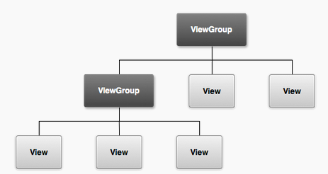
Android is all about creating beautiful interfaces that are intuitive to use.
Download the demo the layout.zip app specifically designed to go with these notes.
How to run the code: You need to unzip the code in your download folder or desktop and then use the File->import->Existing Android code in workspace. Then the project should just run.
OK. Let's get started. Where else but with terminology and UI classes.
The user interface is implemented as collection of view objects (e.g., a date widget, or editable text) -- a view is a class and a widget (e.g., a button) which is drawn on some part of the screen and is responsible for event handling such as when the user interacts with the UI (e.e., clicks on a button, enters the date). User's can construct sophisticated UIs by bundling views together using layouts (or ViewGroups) which can be considered as invisible containers. These containers can hold child containers. Each container defines its views (or other ViewGroups) and their layout properties.

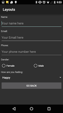
Take a look at the simple UI below -- it's not very exciting but demonstrates a number of common layouts and views. It consists of a simple linear vertical layout of widgets including TextViews, EditTexts, a couple of RadioButtons, a Spinner (currently indicating Happy) and a button with the text go back. We will discuss how to create a common set of layouts using XML.

The Android UI framework is flexible and easily extended. As you would imagine from all the apps you have used on smartphones the UI is a hugely important area to an app. It is also a huge topic that we will not have time to cover in any great depth -- we will take a slice through it. The book covers the UI in great detail so if you want to know more start there.
Download, import, view and run the demo layout.zip but first just install and run the layout.apk. We will use the layout sample code in this lecture to understand a number of things: different UI layouts, click input, toast, saving user data and more. Make sure you don't blindly load and run the code -- you'll learn almost zero from that. Rather, connect the dots. Check through the various activity, layout and resource files.
Try the demo Start the app and check it out.
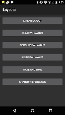
Try out the layout sample project, which includes a number of activities with their associated layouts- we will use it to illustrate a number or important UIs, how to handle user input (e.g., email address or the time). If you install the layouts app you will see its main screen represents a simple linear layout of a bunch of buttons. The first four button render different layouts, specifically: linear layout, relative layout, scrollview and listview. Following this there is a data and time screen and then a button that says SharedPreferences. Date and time use special widgets that the user can interact with to set, yes, the date and time. SharedPreferences is an object that can be used to store small amounts of user data so that when the app is killed and restarted the user's data is restored. Over the course of this lecture we will discuss how to design each of these views and discuss user data more.
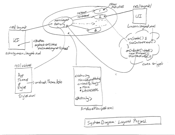
I think it is good to see the app in pictorial fashion, as shown below. The diagram is a blue print for the app. It comprises the MainLayoutActivity and the other 6 activities -- one for each of the buttons (e.g., Linear Layout). Example layouts for the UIs are shown as well as the intents that fire activities, snippets of code, and importantly the AndroidManifest which wires together all components and resources to make the app work. Keep this digram in mind as you go through these notes and refer back to it here and there. It should be helpful.
I'd recommend the following steps to unlocking how a project works:
This is a nice top down approach that lends itself to understanding the app.
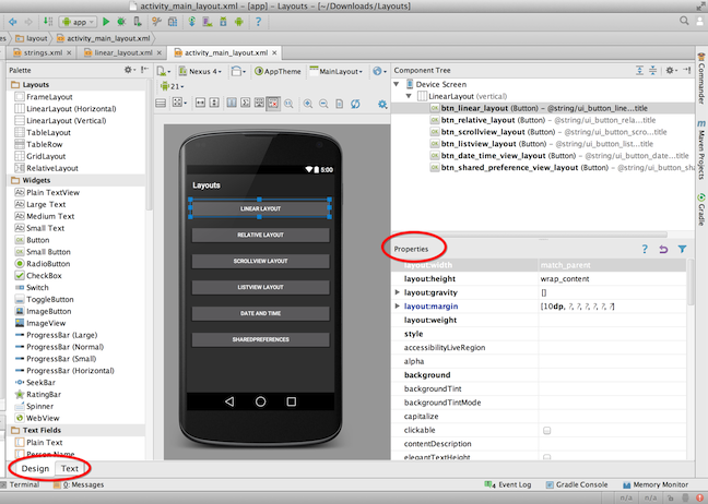
You can build UIs using XML and/or using the design tool. The graphical representation is shown below. My preference is to use XML once I have done some basic layout with the tool. On the left of the figure you can see a list of widgets that you can select, drag, drop and arrange on the screen. Note, that the XML/graphical views can be toggled as shown in the figure. The figure shows the type of layout and highlights the first button -- on the right side you can see the properties of the button, for example, the button id @+id/btn_linear_layout, the width and height are match_parent and wrap_content respectively.
Let's look at the xml view of the same screen -- we only show the first two buttons in this linear layout because they are almost identical. You can look at the complete layout in the file activity_main_layout.xml in the project's layout folder.
In fact you can define your UI with XML or the graphical tool and programmatically in your code in you wish. I recommend specifying your UI not in your program but using the xml presentation. Why? Because it is a good idea to separate the specification of UI from your code. It is more extensible (for example, having different layouts for different devices) rather than littering your program with lots of unnecessary UI code. By keeping things separate you can completely change your UI without changing your code -- that's cool.
It is worth noting in the xml below that the UI elements for example Button closely resemble the name of the class and the methods; for example, Button is the class and the onLinearLayoutClicked is the call back set up to handle user interaction with this button. Other elements are properties of the object. We will discus those shortly.
Themes are Android's mechanism for applying a consistent style to an app or activity. The style specifies the visual properties of the elements that make up your user interface, such as color, height, padding and font size. Android provides three system themes that you can choose from when building apps for Lollipop (Android 5.0+).
When designing the UI you could start with selecting the theme that matches your needs and then, if you wish, customize it further. For now let's look at the layout app with different styles - Theme.Holo.Light (left) and Theme.Holo (right).
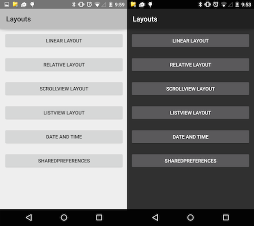
These are set in the xml file res/values/style.xml
<?xml version="1.0" encoding="utf-8"?>
<resources>
    <style name="AppTheme" parent="android:Theme.Material">
    </style>
</resources>
The Theme.Material (is Material.Dark in actual fact) style is the default when you create a project and has the dark look. If you want the lighter theme use:
<resources>
  <style name="AppTheme" parent="android:Theme.Material.Light">
The manifest specifies android:theme="@style/AppTheme">
What is the difference between a theme and style?
A style is a collection of properties that specify the look and format for a view or screen. A style can specify properties such as height, padding, font color, font size, background color, and much more. A style is defined in an XML resource that is separate from the XML that specifies the layout. A theme is a style applied to an entire activity or application, rather than an individual view. When a style is applied as a theme, every view in the activity or application will apply each style property that it supports.
Try the demo: Click on Linear Layout button and check it out (the screen is shown above).
The file below is the activity_main_layout.xml that is associated with the MainActivityLayout activity. This is a simple linear layout with a root or parent element and a vertical layout -- that is, LinearLayout object. In the layout below this represents a container for all the buttons -- so this is a viewgroup with a number of views/widgets (child elements).
<LinearLayout xmlns:android="http://schemas.android.com/apk/res/android"
    xmlns:tools="http://schemas.android.com/tools"
    android:layout_width="fill_parent"
    android:layout_height="fill_parent"
    android:orientation="vertical"
    tools:context=".MainLayoutActivity" >

    **snippet**

    <Button
        android:id="@+id/btn_linear_layout"
        android:layout_width="match_parent"
        android:layout_height="wrap_content"
        android:layout_margin="10dp"
        android:onClick="onLinearLayoutClicked"
        android:text="@string/ui_button_linear_layout_title" />

    <Button
        android:id="@+id/btn_relative_layout"
        android:layout_width="match_parent"
        android:layout_height="wrap_content"
        android:layout_margin="10dp"
        android:onClick="onRelativeLayoutClicked"
        android:text="@string/ui_button_relative_layout_title" />

</LinearLayout>
In the code snippet MainLayoutActivity.java loads the activity_main_layout.xml in the onCreate() callback. We also print some toast to the screen -- just for fun. Toast prints the text screen
public class MainLayoutActivity extends Activity {

    @Override
    protected void onCreate(Bundle savedInstanceState) {
        super.onCreate(savedInstanceState);
        setContentView(R.layout.activity_main_layout);
        Toast.makeText(getApplicationContext(),
                getString(R.string.i_am_here_message), Toast.LENGTH_SHORT).show();

    }

    public void onLinearLayoutClicked(View v) {

        Intent intent = new Intent(MainLayoutActivity.this,
                LinearLayoutActivity.class);
        startActivity(intent);
    }
}
The LinearLayoutActivity displays the screen and simply
public class LinearLayoutActivity extends Activity {

    @Override
    protected void onCreate(Bundle savedInstanceState) {
        super.onCreate(savedInstanceState);

        Toast.makeText(getApplicationContext(),
                getString(R.string.i_am_here_message), Toast.LENGTH_SHORT).show();

        setContentView(R.layout.linear_layout);
    }

    public void onGoBackClicked(View v) {

        Intent intent = new Intent(LinearLayoutActivity.this,
                MainLayoutActivity.class);
        startActivity(intent);
    }

}
Once the intent is fired and LinearLayoutActivity in started it setContentView on R.layout.linear_layout -- the complete XML is shown for this example code. It is busy but you will be able to pick out the layout, viewgroups, views and widgets. There are a number of new views here. Let's briefly discuss them and some of their properties. Explain....
<LinearLayout xmlns:android="http://schemas.android.com/apk/res/android"
    xmlns:tools="http://schemas.android.com/tools"
    android:layout_width="fill_parent"
    android:layout_height="fill_parent"
    android:orientation="vertical"
    tools:context=".MainLayoutActivity" >

    <TextView
        android:layout_width="wrap_content"
        android:layout_height="wrap_content"
        android:layout_margin="5dp"
        android:text="@string/ui_profile_name_title" >
    </TextView>

    <EditText
        android:id="@+id/editName"
        android:layout_width="match_parent"
        android:layout_height="wrap_content"
        android:layout_margin="5dp"
        android:hint="@string/ui_profile_name_hint"
        android:inputType="textCapWords"
        android:singleLine="true" >
    </EditText>

    <TextView
        android:layout_width="wrap_content"
        android:layout_height="wrap_content"
        android:layout_margin="5dp"
        android:text="@string/ui_profile_email_title" >
    </TextView>

    <EditText
        android:id="@+id/editEmail"
        android:layout_width="match_parent"
        android:layout_height="wrap_content"
        android:layout_margin="5dp"
        android:hint="@string/ui_profile_email_hint"
        android:inputType="textEmailAddress"
        android:singleLine="true" >
    </EditText>

    <TextView
        android:layout_width="wrap_content"
        android:layout_height="wrap_content"
        android:layout_margin="5dp"
        android:text="@string/ui_profile_phone_title" >
    </TextView>

    <EditText
        android:id="@+id/editPhone"
        android:layout_width="match_parent"
        android:layout_height="wrap_content"
        android:layout_margin="5dp"
        android:hint="@string/ui_profile_phone_hint"
        android:inputType="phone"
        android:singleLine="true" >
    </EditText>

    <TextView
        android:layout_width="wrap_content"
        android:layout_height="wrap_content"
        android:layout_margin="5dp"
        android:text="@string/ui_profile_gender_title" >
    </TextView>

    <RadioGroup
        android:id="@+id/radioGender"
        android:layout_width="match_parent"
        android:layout_height="wrap_content"
        android:layout_margin="5dp"
        android:orientation="horizontal" >

        <RadioButton
            android:id="@+id/radioGenderF"
            android:layout_width="wrap_content"
            android:layout_height="wrap_content"
            android:layout_weight="1"
            android:text="@string/ui_profile_gender_female" />

        <RadioButton
            android:id="@+id/radioGenderM"
            android:layout_width="wrap_content"
            android:layout_height="wrap_content"
            android:layout_weight="1"
            android:text="@string/ui_profile_gender_male" >
        </RadioButton>
    </RadioGroup>

    <TextView
        android:id="@+id/textInputType"
        android:layout_width="fill_parent"
        android:layout_height="wrap_content"
        android:layout_margin="5dp"
        android:text="@string/ui_mood_spinner_title" >
    </TextView>

    <Spinner
        android:id="@+id/spinnerInputType"
        android:layout_width="match_parent"
        android:layout_height="wrap_content"
        android:layout_margin="5dp"
        android:entries="@array/ui_mood_spinner_entries" >
    </Spinner>

    <Button
        android:id="@+id/btn_goback"
        android:layout_width="match_parent"
        android:layout_height="wrap_content"
        android:layout_margin="5dp"
        android:onClick="onGoBackClicked"
        android:text="@string/ui_button_goback_title" />

</LinearLayout>You can implement the layout using XML or using the design mode as mentioned earlier -- or a combo. Below, the properties of the layout (e.g., layout_width, orientation, etc.) can be set by first drop and dragging the button (in this example case) and the highlight the button and left click to set the properties of the button such as id, layout_width, layout_height, layout_margin, onClick, text.
    <Button
        android:id="@+id/btn_goback"
        android:layout_width="match_parent"
        android:layout_height="wrap_content"
        android:layout_margin="5dp"
        android:onClick="onGoBackClicked"
        android:text="@string/ui_button_goback_title" />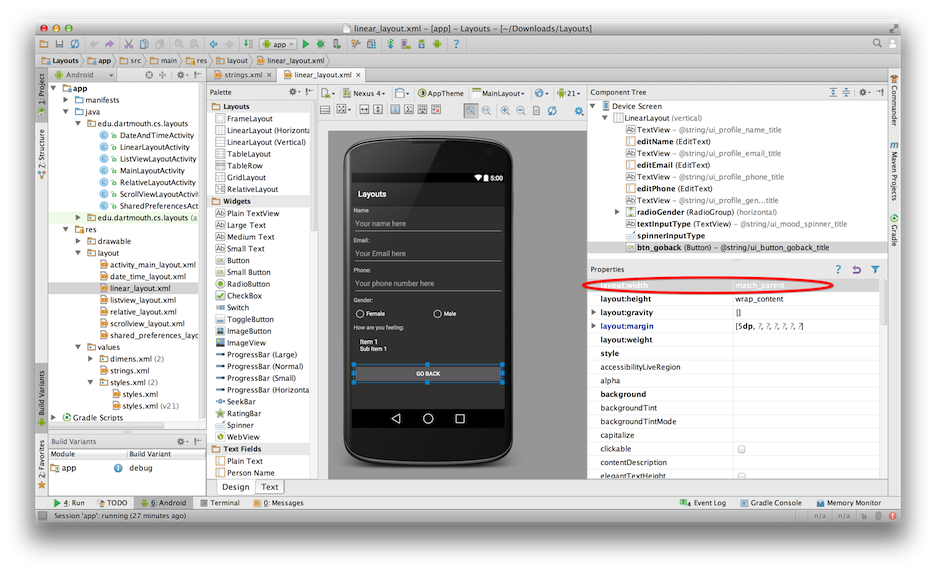
Note, that we use labels for text and not direct text (go back). All string resources are defined in strings.xml file in the resources/values folder - a snippet relating to srings.xml for the linear layout are shown below. Agan, you can use the graphical mode to define strings or just cut and paste in the strings.xml (which is preferable).
    <string name="ui_button_goback_title">go back</string>
    <string name="ui_profile_name_hint">Your name here</string>
    <string name="ui_profile_name_title">Name</string>
    <string name="ui_profile_email_hint">Your Email here</string>
    <string name="ui_profile_email_title">Email:</string>
    <string name="ui_profile_phone_hint">Your phone number here</string>
    <string name="ui_profile_phone_title">Phone:</string>
    <string name="ui_profile_gender_title">Gender:</string>
    <string name="ui_profile_gender_male">Male</string>
    <string name="ui_profile_gender_female">Female</string>
If you open strings.xml in Android Studio then you can view and add to strings using the Resources view or strings.xml as show below. My preference is cut and paste in the xml but as the figure shown you can use a design mode to add and remove strings.
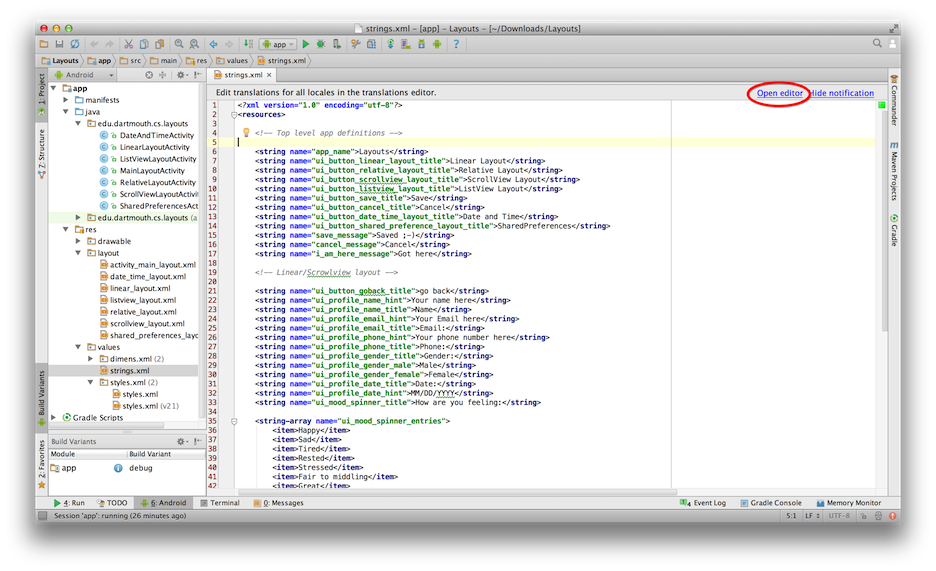
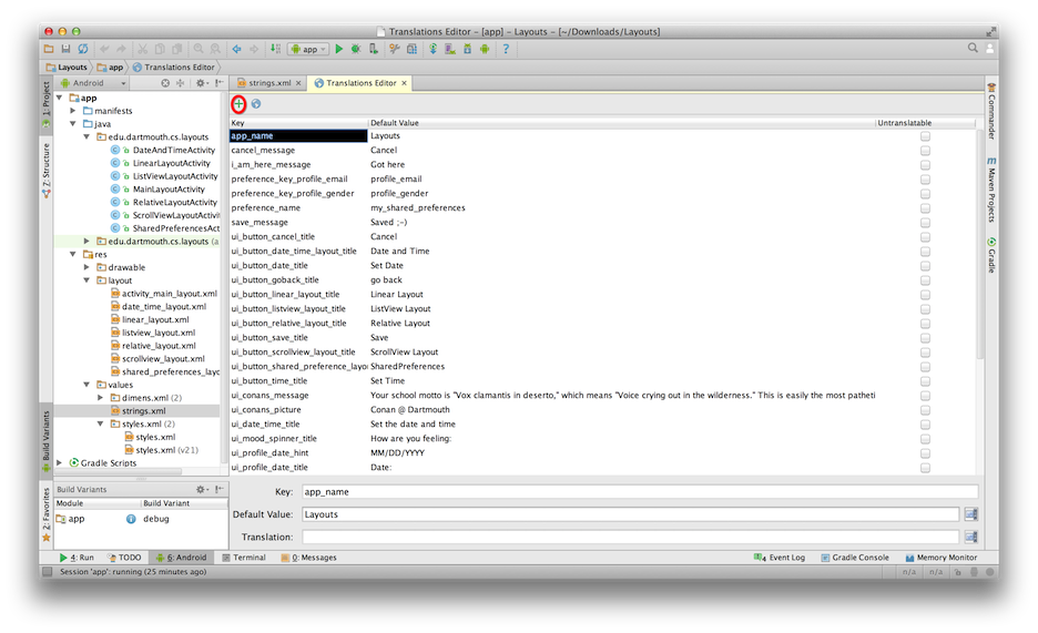
Note, that strings can hold a wide set of items: strings, arrays of strings, integer arrays, colors, styles/themes. We will mostly define strings, string arrays, integer arrays.
For example, we want people to enter their mood using a drop down/up menu selection. We use the Spinner for this an populate it with a set of moods defined by entries that is @array/ui_mood_spinner_entries which is defined in strings.xml. Later in ListView layout we will add an array to the layout programmatically in the code but here we do it all in the xml -- below is a snippet from linear_layout.xml
    <Spinner
        android:id="@+id/spinnerInputType"
        android:layout_width="match_parent"
        android:layout_height="wrap_content"
        android:layout_margin="5dp"
        android:entries="@array/ui_mood_spinner_entries" >
    </Spinner>
And here is the corresponding string array of entries defined in strings.xml. It is better to put these strings and resources in XML and in the resource folder. It is easy to maintain -- if you change the list entries later you simply change the XML and not the code. Again, this is a nice separation of code and resources i.e., data.
    <string-array name="ui_mood_spinner_entries">
        <item>Happy</item>
        <item>Sad</item>
        <item>Tired</item>
        <item>Rested</item>
        <item>Stressed</item>
        <item>Fair to middling</item>
        <item>Great</item>
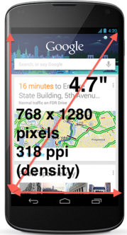
</string-array>How you design a layout is determined by the real estate of the screen -- essentially the size (read pixels dimensions) and pixel density. The figure below shows these display properties of the Nexus 4. The physical size of the phone is 4.7 inches diagonally, the resolution is 768 x 1280 pixels, and the pixel density is 318 ppi (where ppi is pixels per inch. Why does this matter. Well we have to know a little about these display characteristics when designing our views.
When specifying the UI you need to be aware of a number of scaling units. The first is dp, which stands for density-independent pixel. Most people confuse dp with ppi mentioned above. 1 dp is equivalent to one pixel on a 160 dpi screen. Android specifies four screen densities that you see reflected when you create a project. The quantity of pixels within a physical area of the screen is referred to as dpi (dots per inch). Typically, a low density screen has fewer pixels within a given physical area, compared to a medium or high density screens. Android groups all actual screen densities into four generalized densities:
Examples of dp being used include android:layout_margin="5dp" where the margin inside the border of a view is 5dp all around. Another example is using fount size. Here we use sp: the units used below for android:textSize="30sp" is based on scale-independent pixels (sp).
    ** used to set margins in some of the layouts **
    android:layout_marginRight="40dp"
    android:layout_margin="5dp"

    ** used to specify the absolute size of Conan's image**
    android:maxHeight="250dp"
    android:maxWidth="250dp"
    android:minHeight="50dp"
    android:minWidth="50dp"

    ** used to specify font size
android:textSize="30sOnce you have created a set of views, viewgroups, etc. typically as a programmer their are a common set of operations and attributes associated with views.
. properties: for example setting the text of a TextView such as the text, style, font size, position on the screen, how much real estate the view should take up on the screen. These proporties can be set in the XML or programmatically in the code -- a number of time when designing applications some UI properties are known at build time and therefore can be captured in XML and other aspects of the UI remain unknown until run time, in which case, programmability is the solution.
. focus: When you design a screen made up of a bunch of views and view groups you may typically want to focus on one of the views or different views from time to time. You can do this in XML with
. listeners: Many times when you are design a view the user needs to interact with the object. The user can setup listeners or callbacks that will be called when an event fires and specific behavior programmed; for example, when a RadioButton is set by the user the state is saved.
If we look at the attributes associated with the Linear Layout XML (above) we will see a number of strange looking syntax -- these attributes include the following:
     <EditText
        android:id="@+id/editName"
        android:layout_width="match_parent"
        android:layout_height="wrap_content"
        android:layout_margin="5dp"
        android:hint="@string/ui_profile_name_hint"
        android:inputType="textCapWords"
        android:singleLine="true" >
</EditText>There are many other attributes associated with views.
First, here are a bunch of margin based attributes. BTW, padding is the space inside the border between the border and the actual view's content. There is padding all around the content. Margins is outside the border between the border and the other elements next to this view.
Some other important attributes include:
        <RadioButton
            android:id="@+id/radioGenderF"
            android:layout_width="wrap_content"
            android:layout_height="wrap_content"
            android:layout_weight="1"
            android:text="@string/ui_profile_gender_female" />

        <RadioButton
            android:id="@+id/radioGenderM"
            android:layout_width="wrap_content"
            android:layout_height="wrap_content"
            android:layout_weight="1"
            android:text="@string/ui_profile_gender_male" >
</RadioButton>This is a relative layout and a simple one at that -- much more complex relative position of views and widgets within the layout can be achieved. Here we locate the AnalogClock at bottom of the layout (layout_alignParentBottom); the ImageView of our pal Conan (run the apk and click on the dastardly dude) at the top (layout_alignParentTop); and by default the RatingBar is sandwiched between the two widgets -- note we could explicitly do this too.
Try the demo: Click on RelativeLayout button and check it out. Don't you just hate Conan ;-)
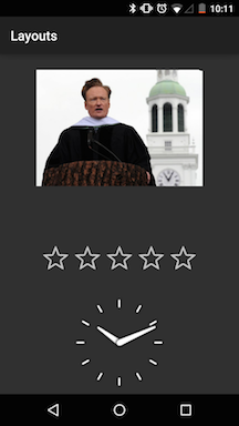
The RelativeLayout has a number of properties that all makes good sense; match_parent will fill the screen and the padding left and right positions the other widgets in the container.
<?xml version="1.0" encoding="utf-8"?>
<RelativeLayout xmlns:android="http://schemas.android.com/apk/res/android"
    android:layout_width="match_parent"
    android:layout_height="match_parent"
    android:paddingLeft="16dp"
    android:paddingRight="16dp" >

    <AnalogClock
        android:id="@+id/analogClock1"
        android:layout_width="wrap_content"
        android:layout_height="wrap_content"
        android:layout_alignParentBottom="true"
        android:layout_centerHorizontal="true" />

    <ImageView
        android:id="@+id/imageViewOfGirl"
        android:layout_width="wrap_content"
        android:layout_height="wrap_content"
        android:layout_alignParentTop="true"
        android:layout_centerHorizontal="true"
        android:layout_marginTop="24dp"
        android:adjustViewBounds="true"
        android:clickable="true"
        android:contentDescription="@string/ui_conans_picture"
        android:maxHeight="250dp"
        android:maxWidth="250dp"
        android:minHeight="50dp"
        android:minWidth="50dp"
        android:onClick="onClickConan"
        android:scaleType="fitXY"
        android:src="@drawable/conan" />

    <RatingBar
        android:id="@+id/ratingBar1"
        android:layout_width="wrap_content"
        android:layout_height="wrap_content"
        android:layout_above="@+id/analogClock1"
        android:layout_centerHorizontal="true"
        android:layout_marginBottom="18dp" />

</RelativeLayout>
RelativeLayoutActivity is simple code with two callbacks - one for onGoBackClicked and onGoBackClicked. Note that in both cases the view object is passed to the callback method.
public class RelativeLayoutActivity extends Activity {

            @Override
            protected void onCreate(Bundle savedInstanceState) {
                        super.onCreate(savedInstanceState);

                        setContentView(R.layout.relative_layout);
            }

            public void onGoBackClicked(View v) {

                        Intent intent = new Intent(RelativeLayoutActivity.this,
                                                MainLayoutActivity.class);
                        startActivity(intent);
            }

            public void onClickConan(View v) {

                        Toast.makeText(this, getString(R.string.ui_conans_message),
                                                Toast.LENGTH_LONG).show();

                        }

}